Valspar is a well-known, industry-leading paint and coatings brand that was established in 1806. Part of the Sherwin-Wiliams family, Valspar has a popular residence at Lowe’s.
Recently they unveiled their 2023 Colors of the Year, which are said to be like a mood ring for your home décor. Using color psychology to match each hue to a room, their selections give special meaning to trend-worthy and forward thinking
These beautiful, livable, ready-to-go shades are rumored to restore and rejuvenate any space. Enjoy this glimpse of six of their twelve colors that connect with specific emotional states or qualities.
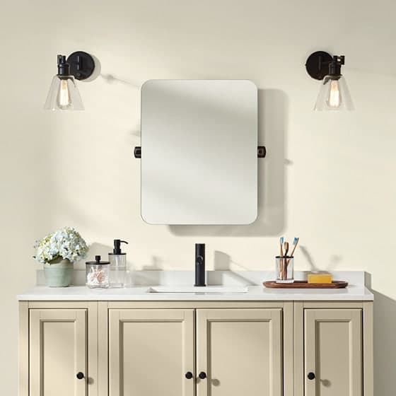
Cozy White; Feeling = Comfort
A warm shade of white evokes comfort and ease, which feels much needed in our world today. In the kitchen, Cozy White on the cabinets offers a warm feeling to match the heart of the home. For modern rustic style, pair with natural wood tones to create a vibe that looks refined, and feels relaxed.
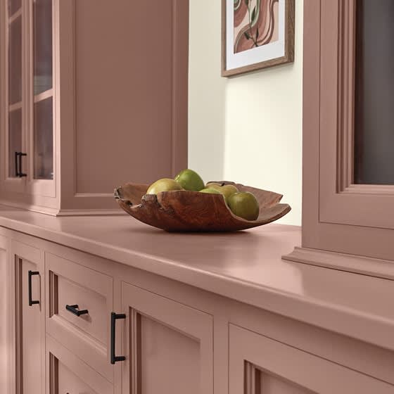
Southern Road; Feeling = Contentment
Inspired by the desire to feel grounded, this tone is recommended for cabinets, an accent wall, or even an interior door. Southern Road is a muted shade of clay with brown undertones, and this earthy hue invites us to simply slow down and bask in a sense of gratitude and inner peace.
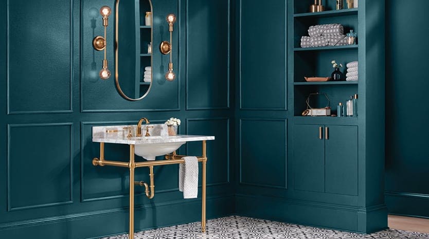
Everglade Deck; Feeling = Restored
This stunning, midnight blue tone is rich, bold, and is intended to revive those running on empty. Its calming depth offers an elegant and elevated look. Pairing with brass fixtures will equal a sparkling pop against the dark blue hue.
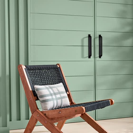
Green Trellis; Feeling = Calm
Mother Nature’s palette generously shares this fresh take on sage green. Valspar’s color pros recommend pairing this mid-toned hue with contemporary elements, like matte black hardware and modern furniture. Matching with darker shades of green such as pine or emerald, the visual effect is lush, layered, and soothing to the senses.
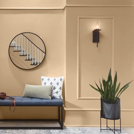
Holmes Cream; Feeling = Joy
Surely we all have a room we want to wrap in warmth and happiness! This is the color for exactly that. This buttery shade of tan shines when brushed on interesting architectural elements, like decorative molding or wainscoting. Paired with a crisp white trim, the contrast makes hearts happy when entering the room.
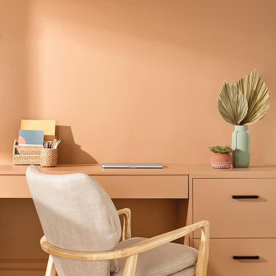
Desert Carnation; Feeling = Inspired
This soft, faded shade of terracotta is laidback and welcoming and, don’t be fooled. Its strong sense of style is intended to be that which brings sleepy spaces – and their owners – to life like never before. Light wood tones and accent pieces in relaxing green hues are perfect matches, giving way to only upliftment – no ruts –in this enlivened space.
See all of Valspar’s 12 Colors of the Year for 2023, and get immersed in their Color-verse - virtually explore and design with all 12 colors in three interactive wings of a home.
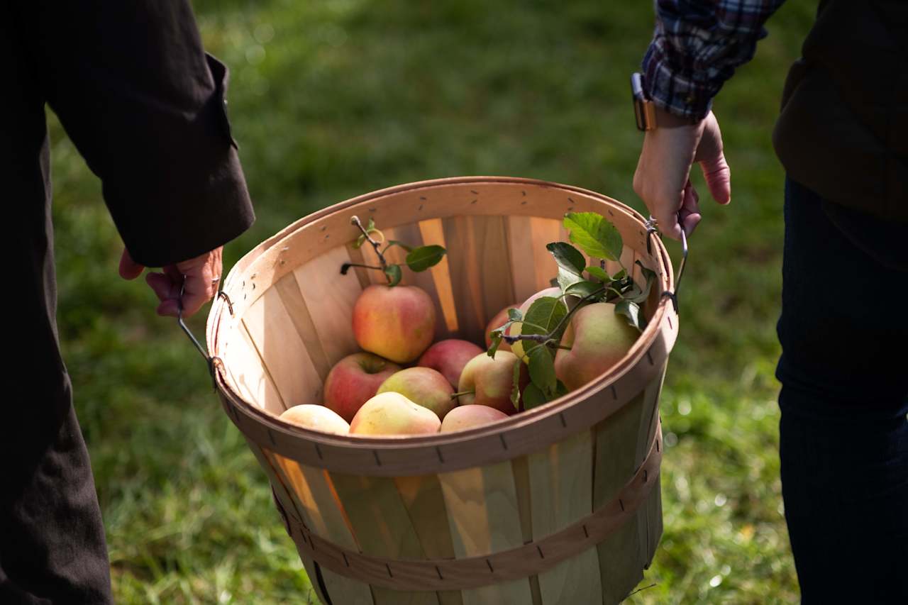
Lead Photo by Andrew Ridley on Unsplash
Design color photos by Valspar